PayPal
PayPal is a financial technology company operating a suite of different products with the mission to democratize financial services across all strata of society. Please note this project talks more about my process rather than the actual output itself. The information on images are placeholders.
Year
2023
Company
PayPal
Project
UX/UI, Product Design
Role
Intern

PayPal Commentary Capture Tool
Overview
In this project, I was working with PayPal’s Business Intelligence Servicing Team. The team required a more efficient means of tracking relevant customer service metrics for Demand, Supply, and Impact. The goal was to not only track these metrics but also to capture insights into the fluctuations. tasked with the objective to refine and enhance PayPal's commentary capture tool for their servicing team. This project aimed at providing a comprehensive UI/UX solution tailored to assist PayPal's team in capturing, analyzing, and commenting on these metrics in real-time.
Blend high visibility with depth
Requirements
The requirements for this project can be categorized into primary requirements and secondary requirements. While it was key to satisfy all requirements, segmenting metrics helped prioritization in the design process.
Primary Requirements:
Pulse Overview of All Metrics: A comprehensive dashboard view where users can rapidly assess the state and health of all relevant metrics, facilitating swift decision-making and task prioritization.
Capture Commentary: Empower users to seamlessly annotate metrics, capturing valuable qualitative insights alongside raw data to paint a fuller picture of trends and fluctuations.
Secondary Requirements:
Quick Deep Dive into Individual Metrics: Beyond just an overview, the tool should allow for a smooth in-depth exploration of specific metrics. This ensures users can delve into the details when needed, unraveling underlying causes or patterns.
Effortless Navigation: An intuitive and user-centric navigation system is crucial. Users should be able to smoothly transition between metrics, ensuring that their journey through the tool is both efficient and easy.
Design
Principles and Process
The design of this app was done keeping three primary principles in mind:
User-Centricity: The entire design process pivoted around the user. Every interaction was developed with an understanding of the user's needs and expectations. Feedback loops were a routine part of the process. The continuous sourcing and integration of insights directly from users ensured that the design was not only intuitive but also catered to their specific needs.
Accessibility: Beyond aesthetics and functionality, it was paramount to ensure the tool could be used by everyone. While colors were used to differentiate metric performance, elements like numerical changes month-over-month and directional arrows were implemented. Such features catered especially to those with color vision deficiencies, ensuring they could derive value and insights as efficiently as any other user.
Consistency: The cognitive load on a user diminishes when they encounter a consistent environment. Whether a user was capturing commentary or deep-diving into metrics, they were greeted with a uniform experience. By maintaining consistency across various metrics and pages, we provided an interface where users felt familiar, irrespective of the function they engaged with.
Typography

Color
Background
Metrics
#FF4136
#FFDC00
#2ECC40
#FFFFFF
#FFFFFF
#373D41
#E6E6E6
#F4F7FA
User Flow
Quick and Easy Access
I started this project by working out a user flow for this experience. Given that the majority of users' end goals revolved around either entering or viewing commentary, the flow was optimized to guide users to the commentary section swiftly. While minimizing the number of clicks in the experience was important, it was also important to provide multiple navigation path to ensure that users can select the path that aligns best with their comfort and familiarity.

Iterative Development
Wireframes
The tool is designed to house several metrics as well as their underlying constituents. When it comes to so many data points, it was challenging to present them in an easily digestible format. Wireframing was a foundational step in this process. It offered a skeletal structure that guided this product's direction. This phase was crucial for iterative development. Each wireframe was accompanied by its unique set of feedback which fed into subsequent iterations. While the development process witnessed the creation of numerous wireframes, they can be broadly categorized into the three phases.
Wireframe 1

Initial Concept
Key Features:
Initial data visualization techniques
Grouped metrics into categories
Objective: Begin with a rudimentary layout in order to determine how to incorporate data points without overwhelming the interface.
Feedback & Iteration: The primary feedback focused on clarity and organization. Was the data presentation intuitive? Was it too much visually?
Wireframe 2

User Integration and Structural Enhancements
Objective: This stage was focused on user interaction. The aim was to figure how users would interact with individual metrics and how the process can be made more seamless
Key Features:
Expandable navigation to reduce clutter
Interactive ability to deepdive into features
Feedback & Iteration: Does the design facilitate smooth navigation? Here, we conducted two A/B tests to find a clean navigation
Wireframe 3
Cohesive Integration
Objective: This was the last stage of wireframing. Here, commentary callouts and the dashboard are combined in one screen, creating a split screen navigation.
Key Features:
Split screen navigation with seamless transitions
Optimized interaction chart based on user feedback
Feedback & Iteration: Now that the product was going to be launched soon, what are some additional features users would like?
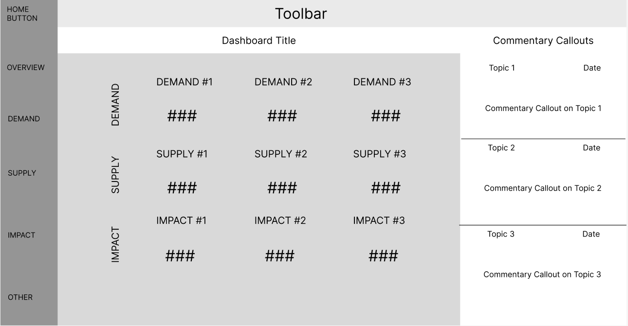
PayPal Commentary Capture Tool
Final Product
After going through the wireframing process, the actual development was fairly similar to Wirefame 3. The only changes were making the process to enter commentary easier and seamless and automatically updating things to minimize user clicks.
Below, you'll find a visual representation of the final product. While the showcased UI/UX captures the essence of the actual product, certain aspects, categories, and visual elements have been altered to maintain confidentiality and to protect sensitive data. Your journey through these visuals will offer insights into the tangible manifestation of our design process.
Should you have any inquiries or wish to delve deeper into any segment of this design journey, please don't hesitate to reach out.


