PayPal
PayPal is a financial technology company operating a suite of different products with the mission to democratize financial services across all strata of society. Please note this project talks more about my process rather than the actual output itself. The information on images are placeholders.
Data Visualization, Product Management
Intern
Company
Year
PayPal
2022
Role
Project
Reporting Tool
Overview
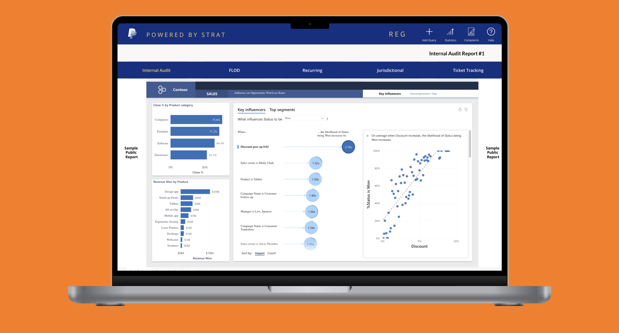
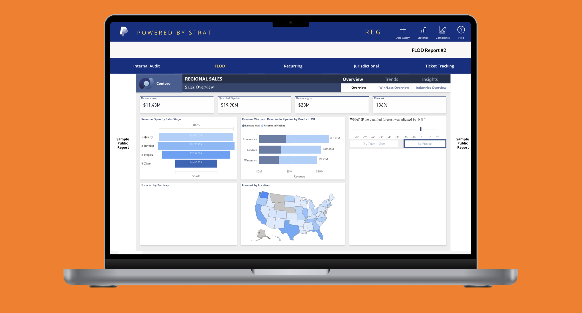
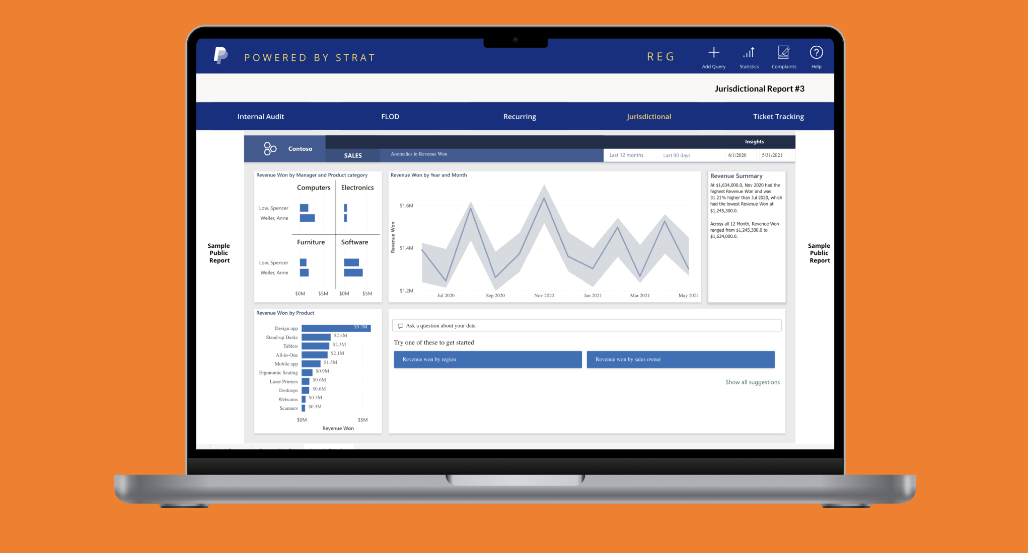
During Summer 2022, my project at PayPal centered around addressing data requests from regulators. These requests placed a consistent drain on resources and often required dedicated efforts to fulfill on a frequent basis. My primary objective was to innovate a solution that would streamline this process, enhancing efficiency while maintaining data accuracy and accessibility. This led to the conceptualization and development of a self-service portal. With the team consolidating data into Tableau dashboards, I devised a unified screen experience allowing users to effortlessly navigate, filter, and download the requisite information. The success of this project was not just automating a tedious process but also creating a portal adaptable across multiple departments that fostered self-sufficiency in reporting.
User Stories and Acceptance Criteria
Requirements
User Stories
To understand the requirements for this product, I started segmenting needs by user stories. I tried to simulate the journey of different stakeholders involved and come up with what their issues might be and how the reporting tool can help them. Doing this process ensured that the design process would cover all potential use cases and the tool would be useful for a plethora of customers.
User stories and pain points
User groups
I want to access specific data without submitting a formal request so that I can get the data quickly and without involving multiple parties
I want to get the latest data across to the client
I want to be able to filter through different categories on my own to see whether a different cut of data makes more sense
Analysts
I want to prioritize working on other tasks rather than spending time writing similar queries to extract data on a frequent basis
Rather than going back and forth, I want analysts to clearly define what they want so that there is minimal repitition
Data Engineers
Trying to monitor whether all the analyst requirements have been met by the deadline is a time consuming process
Any tool should be easy to use so that users require minimal additional assistance in getting the data for themselves
Users should be fully aware of the different capabilities that the tool supports before approaching the team for any data requests
Data Managers POCs
Acceptance Criteria
Based on the various user stories, the next step was to prioritize and come up with acceptance criteria. Acceptance criteria can be understood as the specific metrics the design and experience is hoping to accomplish
Self-Service and Efficiency: The portal must empower users through self-service capabilities and allow them to independently access, filter, and download desired data without the need for formal requests or third-party intervention. Enhanced search capabilities coupled with robust filtering options should provide users with a tailored data retrieval experience.
Intuitive Design and User Education: The tool should prioritize user-centric design, ensuring ease of navigation even for those unfamiliar with data tools. Informative tool-tips, FAQs, or onboarding tutorials should be embedded to guide users and showcase the tool’s full range of capabilities including advanced filtering options, thereby reducing external queries.
Automated and Updated Data Management: The platform should consistently provide the most recent data through automated updates. Features like saved preferences or query templates should cater to users who require similar datasets frequently, streamlining their access process.
Feedback Mechanism and Continuous Adaptation: The portal should incorporate a feedback loop, capturing real-time user insights and suggestions. This ensures the tool not only addresses current needs but can evolve with changing requirements, continuously adapting to offer better self-service functionalities.
Design
Principles and Process
The design of this app was done keeping three primary principles in mind:
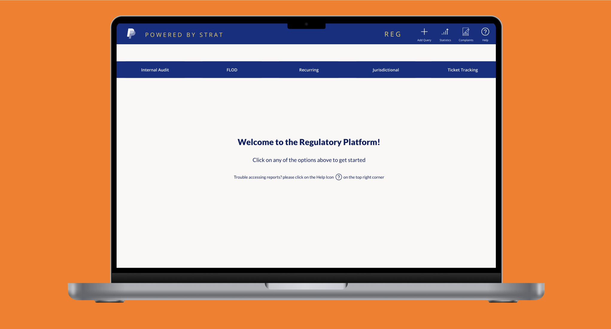
Streamlined Navigation & Access: The tool adopts a single-page design. This ensures that users engage with dynamic iFrames to swiftly navigate between different dashboards. This user-centric approach ensures quick and efficient access to data sets without any formal request procedures. Emphasis was placed on guiding users towards the data they need while ensuring a smooth transition as they switch between different views.
Proactive Troubleshooting & Guidance: Each of the dashboards stored within the tool require a set of permission. Recognizing the potential challenges users might face when denied access to certain Tableau dashboards, the tool is equipped with clear troubleshooting steps. Instead of leaving users frustrated or uncertain, we integrated prominent guidance systems. When a user encounters an access-related issue, they are not just informed about it but also provided clear paths to seek assistance or request additional permissions.
Cohesiveness & Consistency: To reduce the cognitive load and enhance user familiarity, the tool maintains a consistent visual and interaction design across different functionalities. Whether a user is filtering through categories or seeking troubleshooting assistance, the experience feels integrated and seamless, further promoting user confidence and ease of use.
Typography

Color
#FFFFFF
#001C64
#0070E0
#FFD140
#FAF8F5
User Flow
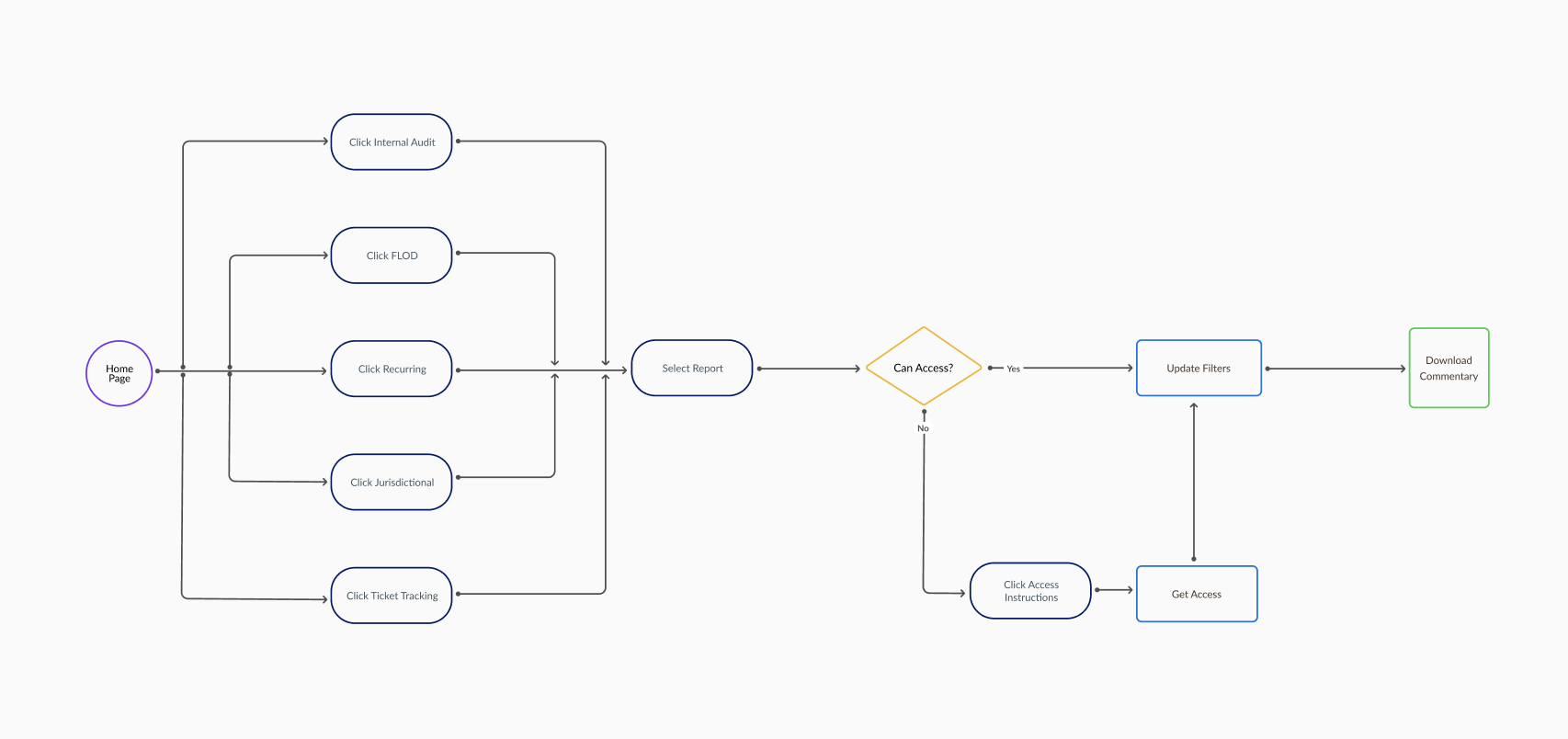
Quick and Easy Access
Given the nature of this tool, the majority of users' end goals revolved around downloading data. Therefore, the goal was to make the process as simple as possible for them to get to that page. The only hurdle users might cross was not having access to the dashboard which is why the “Access” button is visible across all pages and is just a single click
Iterative Development
Wireframes
The wireframing process was pivotal in visually mapping out the user's journey within the tool. Given the unique nature of this project—introducing users to a self-service experience for multiple reports within a single screen—wireframing served as a foundation to structure these functionalities effectively. While the process involved several wireframes, they can be extrapolated into two stages shown below.
Wireframe 1
Vertical sidebar navigation menu

Description: The vertical bar layout emphasized a sidebar navigation. This promoted a hierarchical view of the tool's functionalities. This catered to a more traditional user experience where users are accustomed to vertical sidebars, especially on desktop interfaces.
Benefits:
Utilizes vertical screen real estate effectively
Clearly defines primary and secondary actions
Directs the user's eye in a top-to-bottom progression which aligns more with natural reading patterns
Drawbacks:
Categories are not suited to a hierarchical order of classification
Given the nature of the dashboards, the design should be prioritize using horizontal screen real estate rather than vertical
Expansion system leads to layering of components that might slow down performance
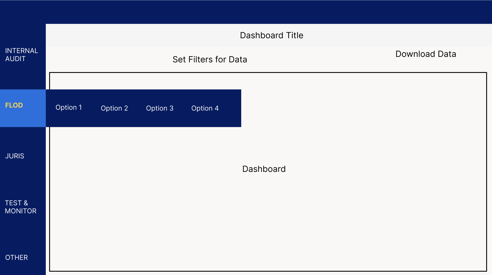
Wireframe 2
Horizontal navigation menu


Description: The horizontal bar layout adopted a top-bar navigation approach that centralizes core functionalities at the top of the interface. It resonates with contemporary web layouts. It prioritizes quick access across multiple sections and caters to the need for broader visibility of the main content.
Benefits:
Maximizes horizontal screen real estate, suitable for dashboards that require wide visibility
Streamlines navigation by providing a left-to-right flow
Allows for instant access to primary functions at the top without the need to scroll or dive deeper
Drawbacks:
Adding more primary options in the navigation bar would lead to cluttering
Continuous horizontal scanning might not be as intuitive for all users as a vertical progression
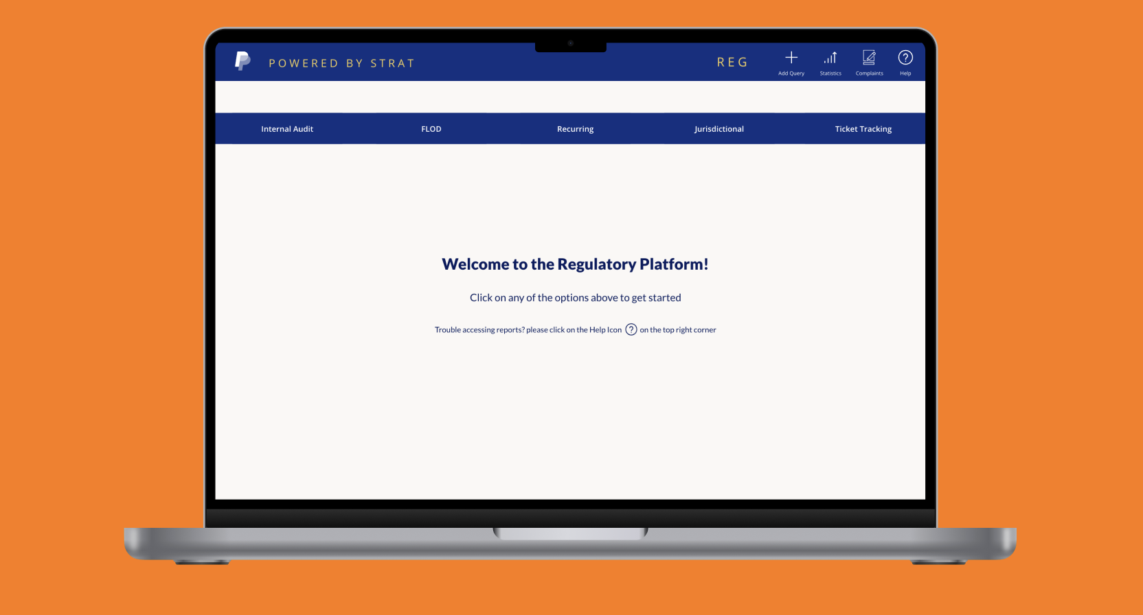
Reporting
Tool
Final Product
Using the wireframes as reference, I created the regulatory reporting tool with the aforementioned color scheme, opting for a horizontal navigation. The platform was a success and it was able to handle all the use cases with an accessible, intuitive UI. To see more of my work and check out the final product, scroll below. Please note that although the UI/UX below closely aligns with the actual product, the categorizations and dashboards are different. This is to prevent any sensitive information being leaked. If you have any questions on the design process or wish to learn more, please contact me.